Weddings and celebrants
Melbourne. We rebuild celebrant sites so they sound like one person, and take the date.
- Industries
- 002 / 003
The argument
A celebrant sells the one thing that cannot be photographed: how they will sound standing in front of everyone the couple has ever met. There is no feature list. There is no comparison table. There is a date, one person gets it, and the couple decides on tone: whether this reads like someone who will make their grandmother laugh, or someone who will read the paperwork out flat.
Which is why the theme sites all fail in the same way. A script font, a slideshow of a wedding that belongs to nobody, and a contact form that asks for a name and a message and never once asks for the date. They are interchangeable, and interchangeable is fatal in a trade where the entire purchase is the person. The couple will come back to that page four times, on a phone, late, and forward it to a mother who will read every word. It has to hold up to being read slowly, twice, by people who are already emotional.
What we build
We build a page with one voice on it, in words the celebrant actually uses, with the ceremonies and the legal detail present and in their right place rather than first, and an enquiry that carries the date, so the one question that decides everything is answered before the reply chain starts.
Shipped: Rushmi To My Vows a full redesign for Rushmi Kumar, a Melbourne marriage celebrant. Her story, her ceremonies and her enquiry flow on one warm, fast page, shipped live.
In their words
I gave them a rough idea of what I wanted and they simply got it done without having to explain myself twice. Turnaround was way faster than I expected too. Genuinely happy with it.
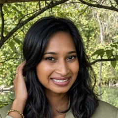 Rushmi Kumar Marriage celebrant, Melbourne
Questions
- What should a marriage celebrant’s website include?
- One voice, the ceremonies, the legal detail in its right place rather than first, and an enquiry that asks for the date. A couple books a celebrant on tone: how this person will sound in front of everyone they know, so the page has to sound like the celebrant rather than like a wedding.
- Why do so many celebrant websites look the same?
- Because they are the same theme. A script font, a slideshow of a wedding that belongs to nobody, and a contact form that asks for a name and a message. That is survivable in most trades and fatal in this one, where the entire purchase is the person: interchangeable pages sell nothing, because being interchangeable is the opposite of what is being bought.
- What should a celebrant’s enquiry form ask for?
- The date, first. It is the one question that decides whether there is a booking at all, and most theme forms never ask it, so the reply chain opens with a question the couple already knew the answer to, and a celebrant spends a week finding out they were never free.
- How long do couples spend on a celebrant’s website?
- Longer than most trades, in several visits. A couple comes back to the page four times, usually on a phone, usually late, and forwards it to a parent who reads every word. It has to hold up to being read slowly, twice, by people who are already emotional, which is a writing problem before it is a design problem.